WORK
ITERATIVE DESIGN
SEM 2
2024

01.BRANDING PROJECT
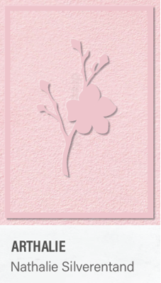
Throughout the branding group project, I got assigned to do the logo and
the business card. Since logo is the representation of the client’s brand,
there was a lot of sketching, making different variations and
communicating with the client. I started off with creating some sketches
in Procreate, asking for feedback from my group members, teachers and the
client. After deciding which sketch is the best, I traced it in Adobe
Illustrator to make it more professional. Combining the logo with the
brands color palate, I made the final version which was later
presented.
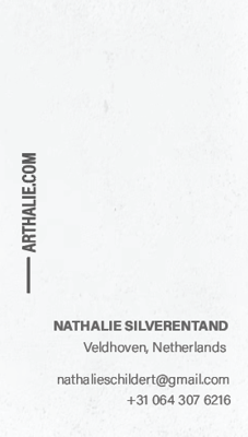
Apart from the logo, I also worked on the business card which contains the
clients key contact information. I started the assignment off with
choosing on the color palette, typography and most importantly, a design
which would fit to the style of the client the best. Both for the logo and
the business card, I went for a simple, elegant design with thin, light
typography and pastel color palette, since those were the clients wishes.
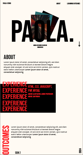
02.MY PORTFOLIO
In the second semester, I also started with designing my new portfolio. I
immediately knew that I wanted to go for a bold, urban design with black
and cream white as base colors, and red as a highlight color. My first
step was to look for and gather some inspiration examples. My next step
was to start designing a layout. I combined the mentioned colors while
playing with strong typography to emphasize different sections of the
website. At the bottom of the website, the visitor will be able to read a
brief explanation of every learning outcome and then click on the button
which will redirect him on the sub-site with all the projects related to
that learning outcome.
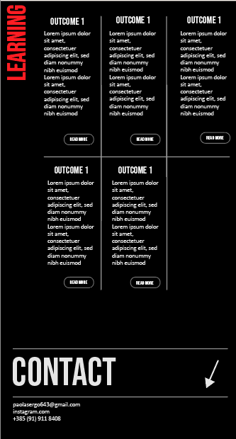
All of the sub-sites will have the same
layout, but different text and photos since each one is dedicated to
another learning outcome. This way, the consistency of the portfolio stays
the same. While designing the layout of the sub-sites, I made the first
one, but wasn’t too happy about it because it stood out from the portfolio
and overall was too basic. So I decided to design a new one, which follows
the overall portfolio vibe more.
I made a mistake by not asking the teachers for feedback during the
designing process, and showed them the final product when it was already
done. But even still, I got some useful feedback on how and where to add
animation, such as kinetic typography to make the website more
interactive. After getting the feedback, I began with coding the
portfolio.
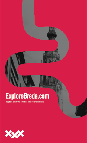
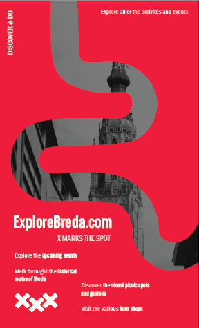
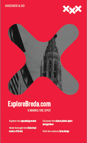
03.EXPLOREBREDA POSTERS
During the media campaign project, one of the marketing ideas to attract
more visitors to the website was through posters. Since I was assigned to
work on it, I first started with looking for inspiration. I also did
research on the colors of Breda and popular tourist attractions to include
it all in one poster and make it visually appealing and informative, since
our target audience were tourists.
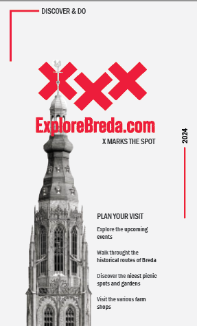
In the final poster versions, I used Breda’s popular red color, combined
with a background image of a church located in the city and a popular
tourist attraction. The posters also include some general information
about what can the visitors see on the website, alongside the slogan: “X
marks the spot”, which is connected to a booklet my group also worked on.
In the first red poster, the “path” serves of creating an illusion of
exploring because the website is about finding spots and activities to
visit in the city. In the second one the “X” cut represents one “X” from
its logo.
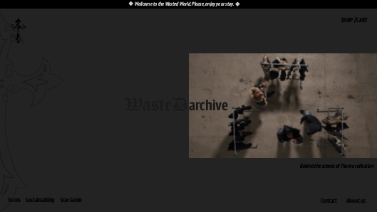
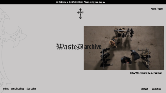
04.PROJECT X DESIGNS
For my final, personal project, I decided to make my own clothing brand,
and focus on creating its identity. This meant, putting most of my efforts
in design, meaning I had to design a logo and a website prototype. Since I
decided to make a streetwear brand, my design was mostly focusing on dark
and bold color palette, which I combined with elements of urban culture.
This resulted in creating a sense of avant-garde, and strong rebellious
self-expression.
I first started on designing a logo. My first step consisted of looking
for inspiration on the internet, where I got a general idea of combining
crosses and cybersigilism in my logo. I then proceeded to sketch a few
ideas in Procreate. After discussing with my peers, I went for the one
featuring a cross. I then traced it in Adobe Illustrator, and made a few
versions for different displays and usages of the created logo.
My next step was to design a website prototype. I started doing it in
Adobe Illustrator because I am more familiar with it, than I am with
Figma. I was heavily inspired by other clothing brand websites, so by
combining my own ideas, and ideas I got from observing other websites, I
brought it into the final product. The website prototype does not feature
any colors except for different shades of black and white because that
way, it matches with the brands identity. The iterations were mostly
circling around background colors, and certain element positions. After
finishing the designs, I transferred them to Figma, in order to make it
interactive, and conduct user testing for potential improvements.
05.MY REFLECTION
In the second semester, I got to work on designing different media
products, such as: logo’s, website layouts, posters, business cards, game
prototypes,… All of them were created using professional tools such as
Adobe Creative Cloud products and Figma. During our group projects, I
really liked the contact we had with our clients. I learned how to deal
with people’s opinions and requests, to ultimately combine them with my
ideas into the final deliverable. I liked the challenge of creating
something with elements and features I wouldn't normally choose, but had
to because the client expressed they wanted it that way. This also helped
me improve my professional standard because it’s something I will have to
get used to if I want to continue working in this field. I also found that
researching and implementing the latest trends into the product, brings a
more modern outcome. I took the same step when designing my portfolio,
because I wanted it to be more modern and up to date with the trends.
Apart from that, I really enjoyed working on it, because it allowed me to
express myself through my own creativity. It also gave me the opportunity
to show my designing skills, and later on, my coding ones. Since I want to
pursue a career in graphic design, I enjoyed researching on the latest
website trends and looking at which features and effects are popular right
now, so that I can include them in my portfolio.
CONTACT

paolasergo643@gmail.com
vsco.com
+31 0 643 265 6646